
What Makes a Yearbook Spread Feel “Timeless”?
Trendy is fun.
Timeless is powerful.
There’s nothing wrong with loving what’s popular right now. But here’s the truth:
If your spread screams “2026 TikTok trend,” it might feel outdated by graduation.
So how do you design a spread that still feels amazing 10… 20… even 50 years from now?
Let’s break it down.
1. Real Stories > Design Gimmicks
A timeless spread always starts with strong content.
Real quotes
Specific details
Names spelled correctly
Moments that actually mattered
Trendy graphics fade.
Real memories don’t.
If someone opens the book at their 20-year reunion, they won’t care about your drop shadow effect. They’ll care about what people said, what happened, and how it felt.
Hot Take: A simple design with powerful storytelling beats a “Pinterest-perfect” layout with weak content every time.
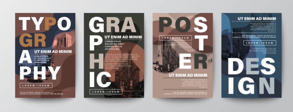
2. Clean Typography That Doesn’t Try Too Hard
Fonts date a spread faster than almost anything.
The safest timeless combo?
One strong headline font
One clean body font
Consistent spacing
Think classic, readable, intentional.
Instead of chasing “the trendiest font of the month,” focus on clarity. If it’s easy to read and well spaced, it will age well.
Remember:
Avoid overly decorative headline fonts
Avoid stacking 5 different styles on one page
Use white space confidently
Timeless spreads feel calm, not chaotic.
3. Balanced Layout (Not Overdesigned)
A timeless spread doesn’t feel crowded.
It has:
Clear focal points
Visual breathing room
Intentional hierarchy
If everything is bold, nothing is bold.
When someone flips through your book years later, their eye should move naturally through the page — headline → main photo → supporting copy → details.
Simple structure = lasting impact.
4. Photography That Captures Emotion
Let’s be honest.
What makes old yearbooks magical isn’t the design.
It’s the faces.
A timeless spread includes:
Genuine expressions
Candid moments
Emotion over perfection
Slightly blurry but real? Sometimes better than perfectly posed but stiff.
If your photos feel honest, the spread will feel timeless.
5. Colors That Support — Not Dominate
Trendy neon gradients? Fun.
Will they age well? Maybe not.
Timeless spreads often:
Use school colors intentionally
Stick to 2–3 accent colors
Avoid overwhelming backgrounds
When color enhances instead of distracts, your spread feels elevated.
6. Trends Are Fine — Just Don’t Let Them Run the Page
You can absolutely use trends.
Just anchor them in structure.
For example:
Add a trendy sticker style — but keep your grid clean.
Use a handwritten accent — but keep body copy classic.
Try a bold headline — but balance it with white space.
Timeless doesn’t mean boring.
It means thoughtful.
7. Ask This Question Before You Submit
Before you finalize a spread, ask:
“Will this still feel readable, emotional, and clear in 20 years?”
If the answer is yes — you’re doing it right.
If the design feels like it depends on a current social media vibe to make sense… simplify it.
Final Thought
The goal of a yearbook isn’t to look trendy.
It’s to preserve a moment in time in a way that still feels meaningful later.
Design trends change.
Typography changes.
Color trends change.
But good storytelling, clean structure, and real emotion?
That never goes out of style.