
Minimalism vs. Maximalism: Which One Is Your Style?
When it comes to designing your yearbook spread, there are two major vibes taking over high school design right now:
Minimalism 🤍
Maximalism 🎉
Both are cool. Both can win awards. Both can totally flop if you don’t use them right.
So the real question is… Which one fits your style?
Let’s break it down.
Minimalism: Clean. Calm. Confident.
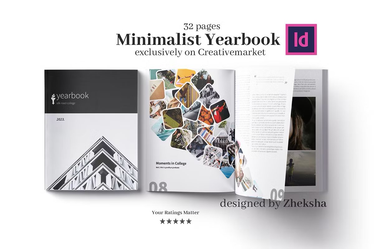
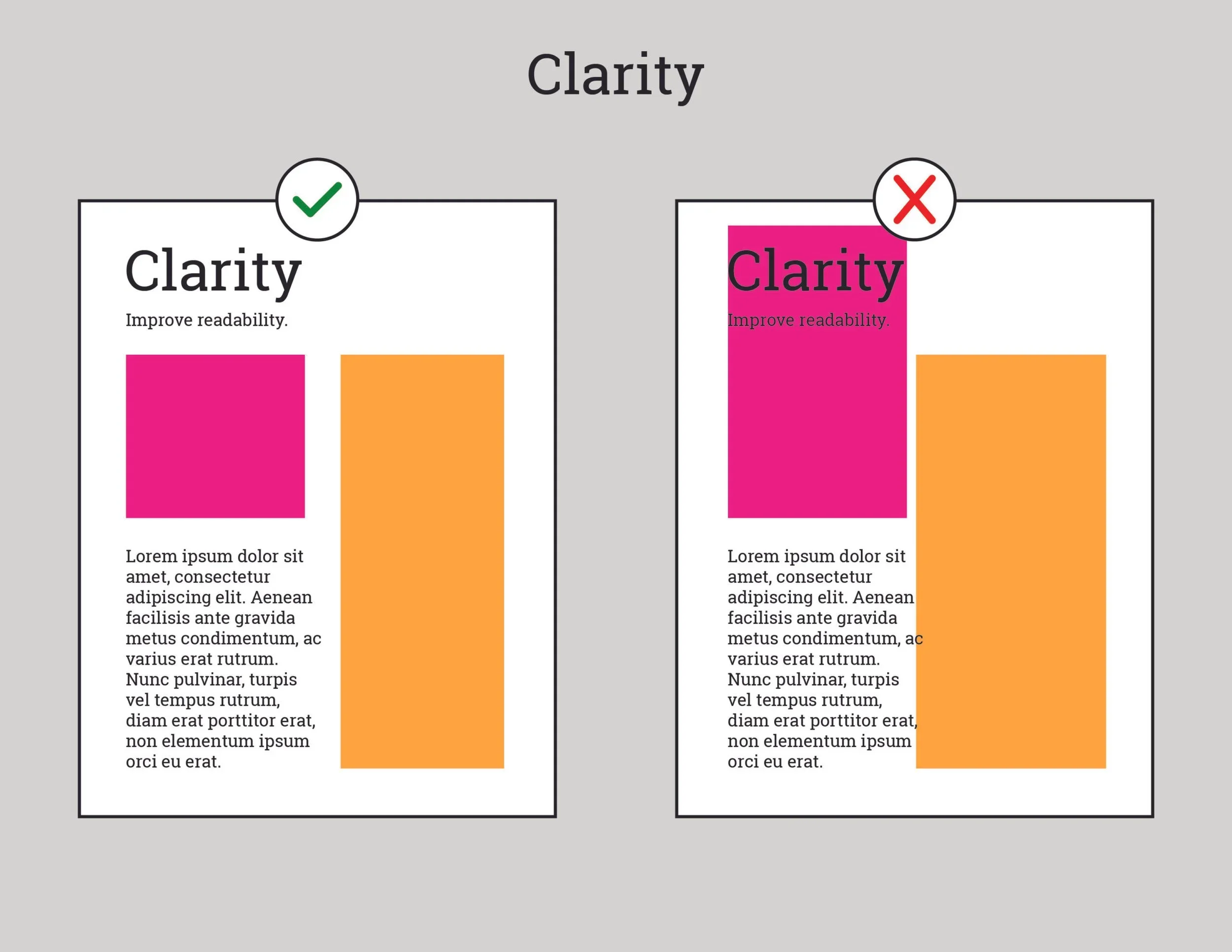
Minimalism is all about less—but better.
It focuses on:
Lots of white space
Clean typography
Simple color palettes
Strong, intentional photos
Clear hierarchy
Think:
One powerful headline.
Two clean fonts.
Three colors max.
Minimalism doesn’t scream for attention. It whispers confidently.
Why Students Love It:
It looks modern and aesthetic.
It makes photos stand out.
It feels organized (your editor will thank you).
It ages well — no “why did we think that looked good?” five years later.
When Minimalism Wins:
Senior spreads
Academic features
Emotional storytelling pages
Portrait-heavy layouts
⚡ Hot Take: Minimalism is harder than it looks. If your spacing is off, it shows.
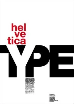
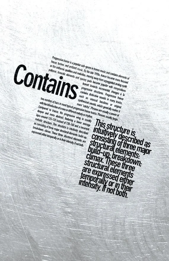
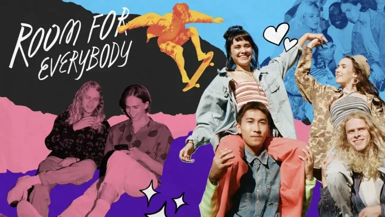
Maximalism: Bold. Loud. Unapologetic.
Maximalism says:
“Why choose one design element when you can use ALL of them?”
It includes:
Bold colors
Layered graphics
Multiple textures
Big typography
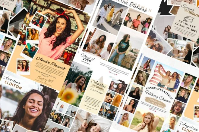
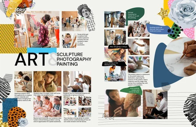
Collage-style layouts
Controlled chaos
Maximalism is energy on a page.
Why Students Love It:
It feels fun and expressive.
It captures school spirit.
It stands out instantly.
It reflects real high school chaos (in the best way).
When Maximalism Wins:
Spirit weeks
Pep rallies
Sports spreads
Clubs & events pages
⚡ Hot Take: Maximalism only works if it’s controlled. Random ≠ creative.
The Truth? You Probably Need Both.
Here’s what award-winning books understand:
It’s not Minimalism or Maximalism.
It’s knowing when to use each.
A full yearbook of only minimal spreads?
Boring.
A full yearbook of only maximal spreads?
Exhausting.
The magic happens when:
Calm spreads balance busy ones.
Loud pages highlight quiet ones.
You create visual rhythm throughout the book.
That’s how you design like a pro.
Quick Quiz: Which Are You?
Answer honestly:
Do you love neutral color palettes or neon everything?
Do you prefer clean grids or overlapping layers?
Does clutter stress you out… or inspire you?
Mostly calm + clean? → Minimalist
Mostly bold + chaotic? → Maximalist
Somewhere in between? → You’re a designer.
Final Advice for Yearbook Staffers
No matter your style:
Limit your fonts (seriously).
Be intentional with color.
Use white space on purpose.
Don’t copy Pinterest — adapt it.
Design for your school’s personality.
And remember…
Your yearbook isn’t just a trend.
It’s a time capsule.
Design it in a way that still feels cool when you’re 28.