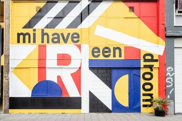
Typography That Slaps: How to Use Fonts in Your Yearbook (Without Making It Messy)
Let’s talk fonts. Typography can make your yearbook spread look clean, professional, and intentional… or chaotic, outdated, and straight-up hard to read. The good news? You don’t need to be a design expert to use typography well. You just need a few solid rules—and maybe a little tough love.
Let’s break it down.
Stop Using 5 Fonts on One Page (Here’s the Rule to Follow Instead)
If your spread has more fonts than people in your friend group, it’s too many.
The golden rule:
👉 Stick to 2 fonts.
👉 3 max if you really know what you’re doing.
A clean setup looks like this:
Font 1: Headlines
Font 2: Body copy
Font 3 (optional): Captions or accents
Too many fonts = visual noise. Your reader shouldn’t feel dizzy flipping pages.
Serif vs. Sans Serif: When to Use Each in a Yearbook
Quick breakdown:
Serif fonts (little feet on the letters):
Feel classic, formal, traditional
Great for body copy or feature stories
Think: timeless, newspaper vibes
Sans serif fonts (clean, no feet):
Feel modern, bold, youthful
Perfect for headlines, section titles, quotes
Pro move: Use sans serif for headlines and serif for body copy to create contrast without chaos.
Why Your Headline Font Shouldn’t Match Your Body Copy
If your headline looks exactly like your paragraph text, how is the reader supposed to know what matters?
Your headline should:
Be bolder
Be bigger
Look different
Contrast creates hierarchy. Hierarchy tells the reader:
“Read THIS first.”
Matching fonts everywhere = boring and confusing. Let your headlines speak louder.
How to Pair Fonts Like a Pro (Even If You’re New)
You don’t need fancy font theory. Just follow these rules:
✔ Pair a bold font with a simple font
✔ Pair a decorative font with a plain one
✔ Never pair two fonts that look almost the same
If the fonts look like siblings instead of opposites, it’s a no.
💡 When in doubt:
Bold sans serif headline + clean serif body copy = always safe
Fonts That Look Trendy Now… and Dated Later
Some fonts scream “THIS WAS MADE IN 1980.”
Be careful with:
Overly curly scripts
Ultra-thin fonts
Super novelty styles
Trendy fonts are fun—but use them sparingly. A yearbook should still look good 10 years from now, not just on Instagram today.
Ask yourself:
“Would this still look cool at a reunion?”
How Letter Spacing Can Instantly Improve Your Headlines
This is a small change with BIG impact.
For headlines:
Try slightly increasing letter spacing
Especially for ALL CAPS text
It instantly makes your headline:
• Cleaner
• More readable
• More professional
Just don’t overdo it—if the letters look lonely, you went too far.
Why Comic Sans Is a Crime (Sorry, Not Sorry)
We said what we said.
Comic Sans:
❌ Looks unprofessional
❌ Doesn’t age well
❌ Distracts from your content
Unless you’re designing a kindergarten flyer or a joke page (and even then… maybe don’t), Comic Sans has no place in a yearbook.
There are so many better fonts. Choose wisely.
Final Typography Cheat Code
If you remember nothing else, remember this:
Fewer fonts = better design
Contrast > matching
Readability always wins
Trends fade, clean design doesn’t
Your yearbook is a time capsule. Make sure it looks intentional, not accidental.

