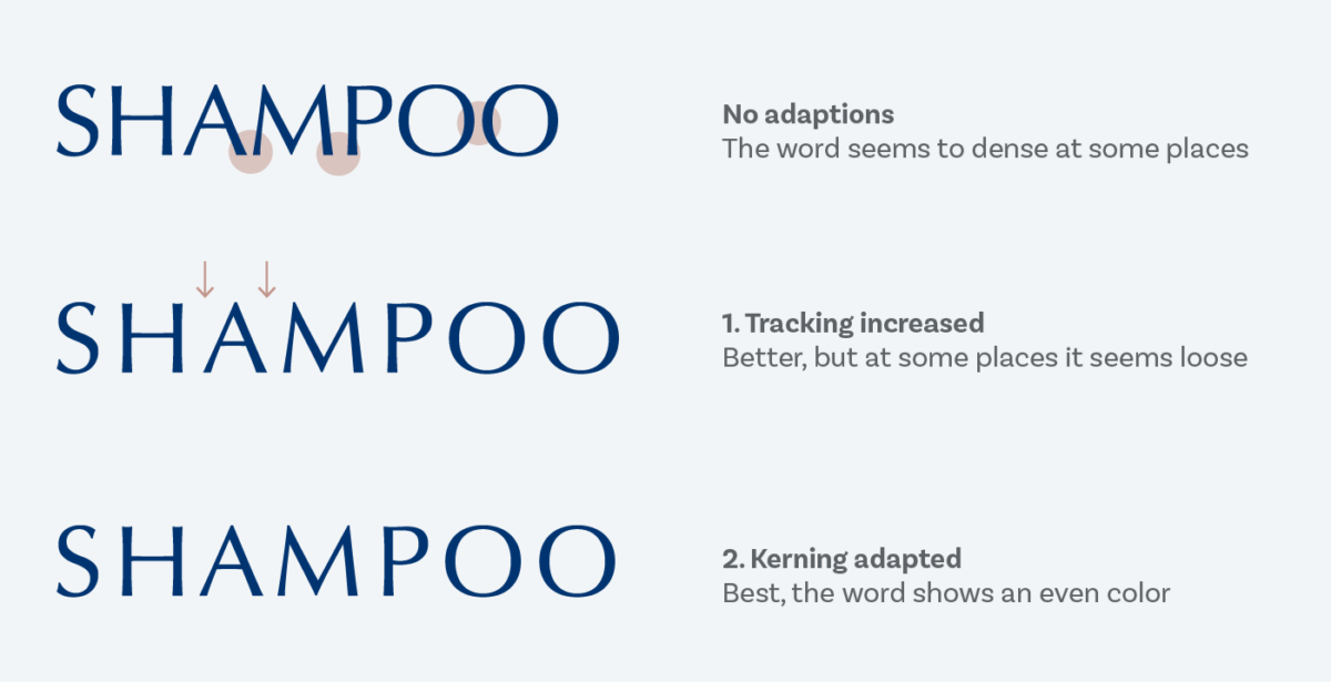
How Letter Spacing Can Instantly Improve Your Headlines
Let’s talk about one of the most underrated design glow-ups in yearbook layouts: letter spacing (aka tracking).
It’s small. It’s subtle. And it can take your headline from meh to magazine-level in about 5 seconds.
If your headlines ever feel too cramped, too loud, or weirdly hard to read, this is probably why.
First: What Is Letter Spacing?
Letter spacing is the space between each letter in a word.
Not line spacing. Not font size. Just the breathing room between characters.
Designers tweak this all the time—especially in headlines—because it changes the vibe instantly.
Why Letter Spacing Matters (Especially in Headlines)
Headlines are supposed to:
Grab attention
Be readable at a glance
Set the mood of the page
Bad letter spacing can:
Make words feel squished
Make bold fonts feel aggressive
Make clean designs feel messy
Good letter spacing:
Makes headlines feel intentional
Adds confidence to your layout
Instantly looks more professional (even if the font is basic)
The Golden Rule for Headlines
The bigger the headline, the more space it usually needs.
When text gets larger, letters naturally feel closer together—even if they technically aren’t. Adding a little spacing helps balance things out.
Rule of thumb:
Small text → little to no extra spacing
Big headlines → add a touch of spacing
Not a ton. Just enough to let the letters breathe.
When to ADD Letter Spacing
Use extra spacing when your headline:
Is in ALL CAPS
Uses a bold or heavy font
Is meant to feel clean, modern, or dramatic
Is short (1–4 words works best)
Example:
SPIRIT WEEK
looks way better with slight spacing than jammed together.
When NOT to Add Letter Spacing
Don’t add letter spacing when:
You’re working with body copy (harder to read)
The font is already thin or wide
The headline is long (it can get awkward fast)
If you squint and it looks like the letters are drifting apart emotionally… you’ve gone too far.
A Quick Yearbook Staff Test
Before you lock your spread, try this:
Duplicate your headline
Add a small amount of letter spacing to one version
Zoom out
Ask: Which one looks more confident?
Nine times out of ten, it’s the spaced one.
Pro Tip: Less Is More
You’re not trying to make the letters obvious—you’re trying to make the design feel better without people knowing why.
If someone notices the spacing immediately, it’s probably too much.
Final Takeaway
Letter spacing is one of those designer secrets that feels illegal because it’s so easy—but it works.
So next time your headline feels “off” and you can’t explain why…
Check the spacing.

