
Yearbook Design Trends Students Are Loving Right Now
If your yearbook still looks like it’s stuck in 2016… we need to talk.
Trends change fast — especially when you’re designing for high school students who live on TikTok, Instagram, and Pinterest. The good news? You don’t need to redesign your entire book to stay current. A few smart updates can instantly level up your spreads.
Here are the yearbook design trends students are obsessed with right now — and how to use them without going overboard.
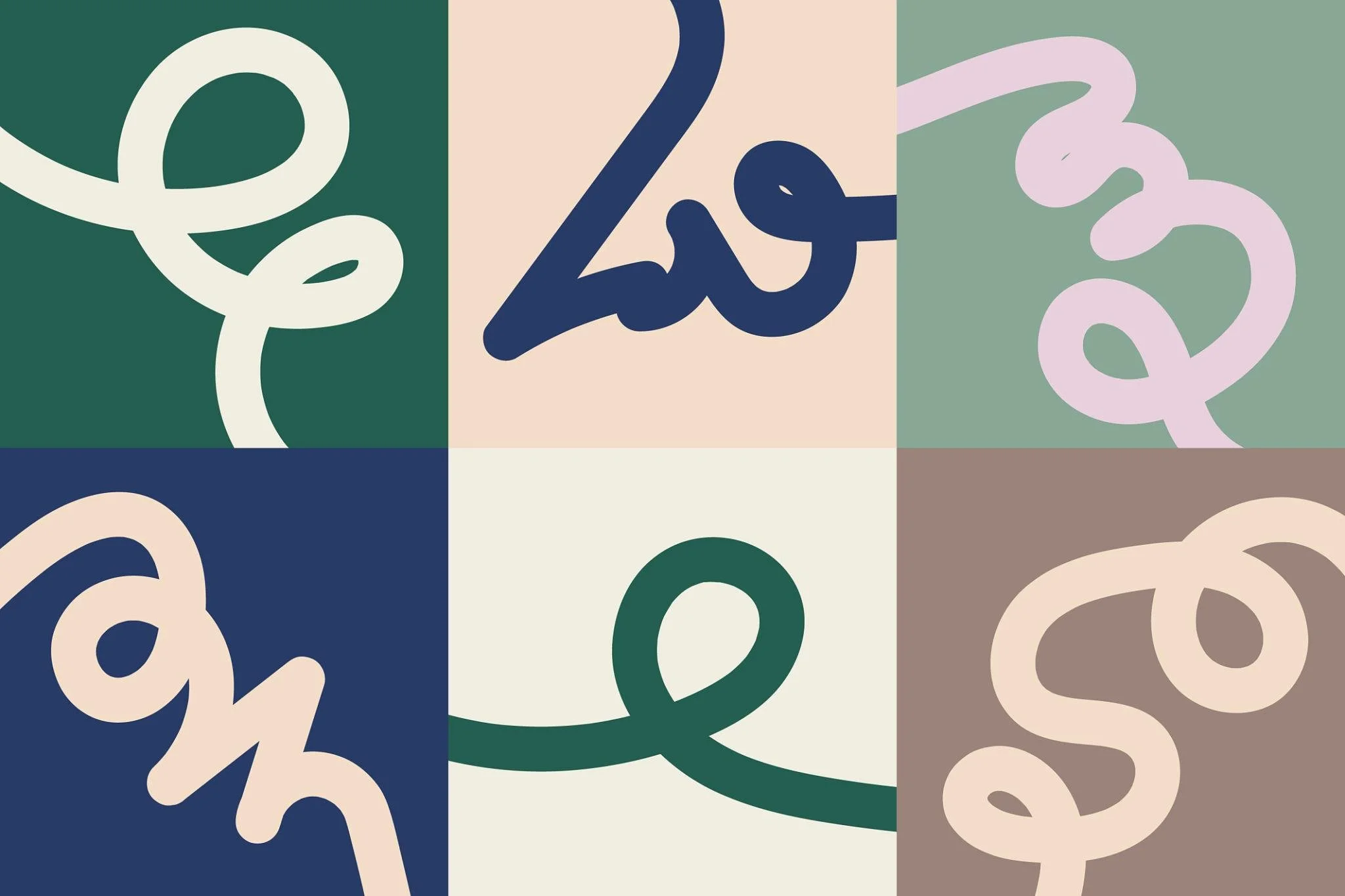
1. Handwritten & Marker-Style Fonts
Students are loving fonts that feel personal and imperfect.
Think:
Brush scripts
Marker-style lettering
Doodle-inspired type
Slightly messy (on purpose)
It gives pages personality and makes spreads feel less corporate and more student-created.
Hot Tip:
Use handwritten fonts for:
Section openers
Pull quotes
Small accent phrases
Don’t use them for body copy. (Please. We still need to read it.)
2. Collage & Scrapbook Vibes
Perfectly aligned grids are cool… but layered, scrapbook-style layouts are cooler.
We’re seeing:
Overlapping photos
Tape graphics
Polaroid-style frames
Torn paper edges
Layered textures
It feels nostalgic, creative, and very “main character energy.”
Hot Take:
Controlled chaos > boring perfection.
Just make sure:
Alignment is still intentional
Photos aren’t covering faces
The page doesn’t look crowded
There’s a difference between creative and cluttered.
3. Big, Bold Headlines That Take Over the Page
Tiny headlines are officially out.
Students love:
Oversized type
Words that run off the page
Vertical text
Transparent text over photos
Headlines should feel like a statement — not an afterthought.
Design Rule:
If your headline doesn’t grab attention from 5 feet away, make it bigger.
4. Muted Color Palettes with One Pop
Super bright rainbow overload? Not trending.
Right now students are loving:
Earth tones
Creams + tans
Sage green
Dusty blue
Soft neutrals
With one bold pop color used intentionally.
Example:
Neutral background + neon pink accent lines
OR
Cream + brown + one electric blue headline
It feels modern. Clean. Aesthetic.
5. Candid Photography Over Posed
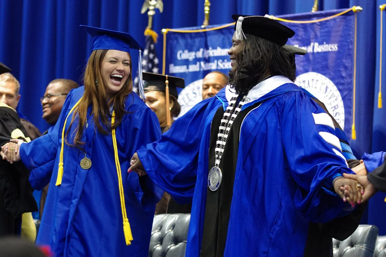
Perfectly lined-up group shots? Necessary.
But what students love?
Laughing mid-sentence
Walking to class
Reaction shots
Game-winning moments
Real emotion
Authenticity wins every time.
If it looks like it belongs on someone’s Instagram story, you’re doing it right.
6. Minimalism (But Make It Cool)
White space is not empty space.
Students are gravitating toward:
Clean layouts
Fewer fonts
Simple color palettes
Strong focal points
Minimal doesn’t mean boring.
It means intentional.
Remember the golden rule:
👉 If everything is loud, nothing stands out.
Trend Warning ⚠️
Not every trend belongs in your book.
Ask:
Does this match our school vibe?
Will this still look good in 10 years?
Are we using this consistently?
Trends are tools — not the whole toolbox.
Final Thoughts from RJ Ink
As you’re designing this year’s book, think about what feels current right now — but balance it with timeless design principles.
The best yearbooks don’t just follow trends. They reflect the personality of the students who created them. And that’s the real trend that never goes out of style.